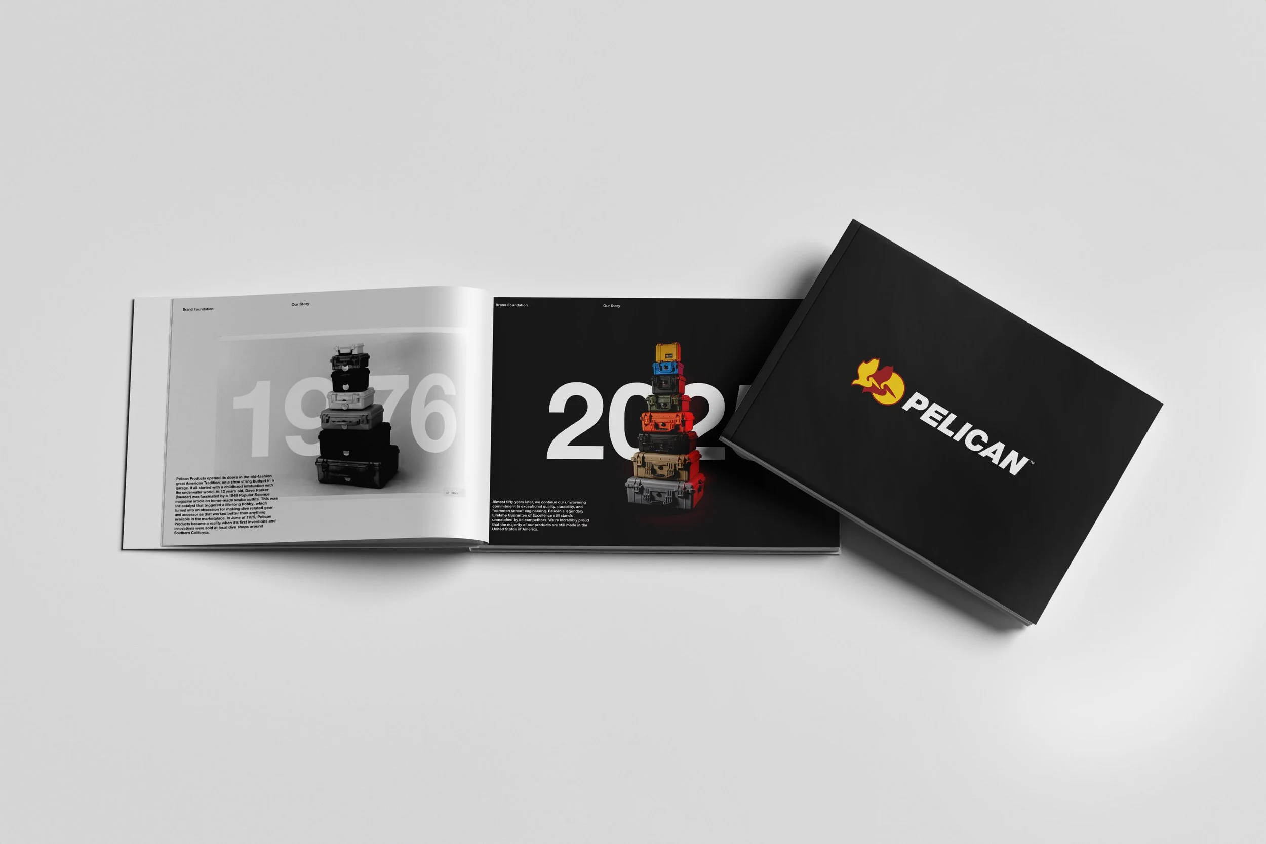
Book 1: Brand Foundations Book
Problem to be solved:
Over the years, Pelican has grown into a global brand with deep roots and an even deeper reputation for durability. But with that growth came a flood of creative work; ads, packaging, presentations, videos each telling the brand story a little differently. Without a clear foundation guiding those expressions, our identity began to splinter. The result was a brand that didn’t always look or feel like itself. To protect what makes Pelican iconic, we needed a shared foundation something that could align teams, inspire consistency, and bring our brand story into sharp focus.
My Approach:
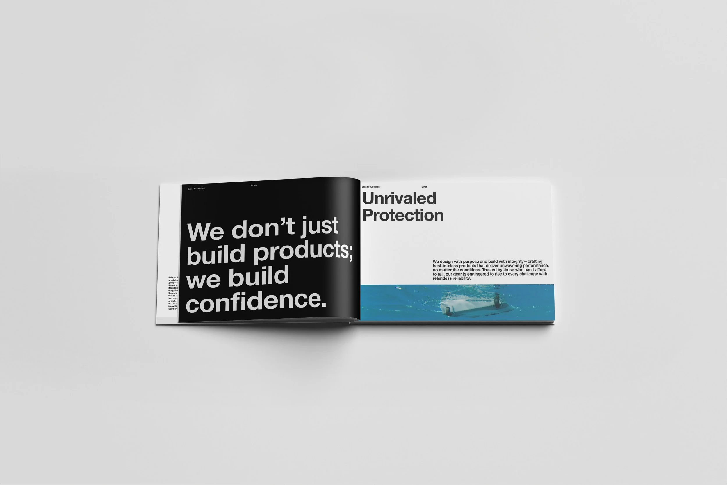
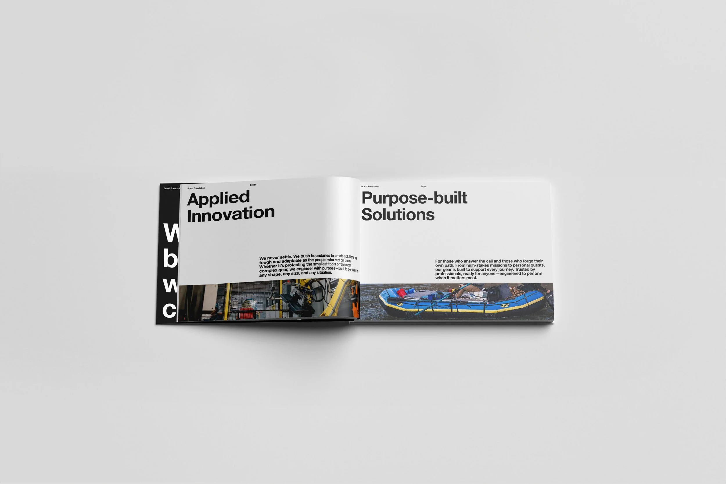
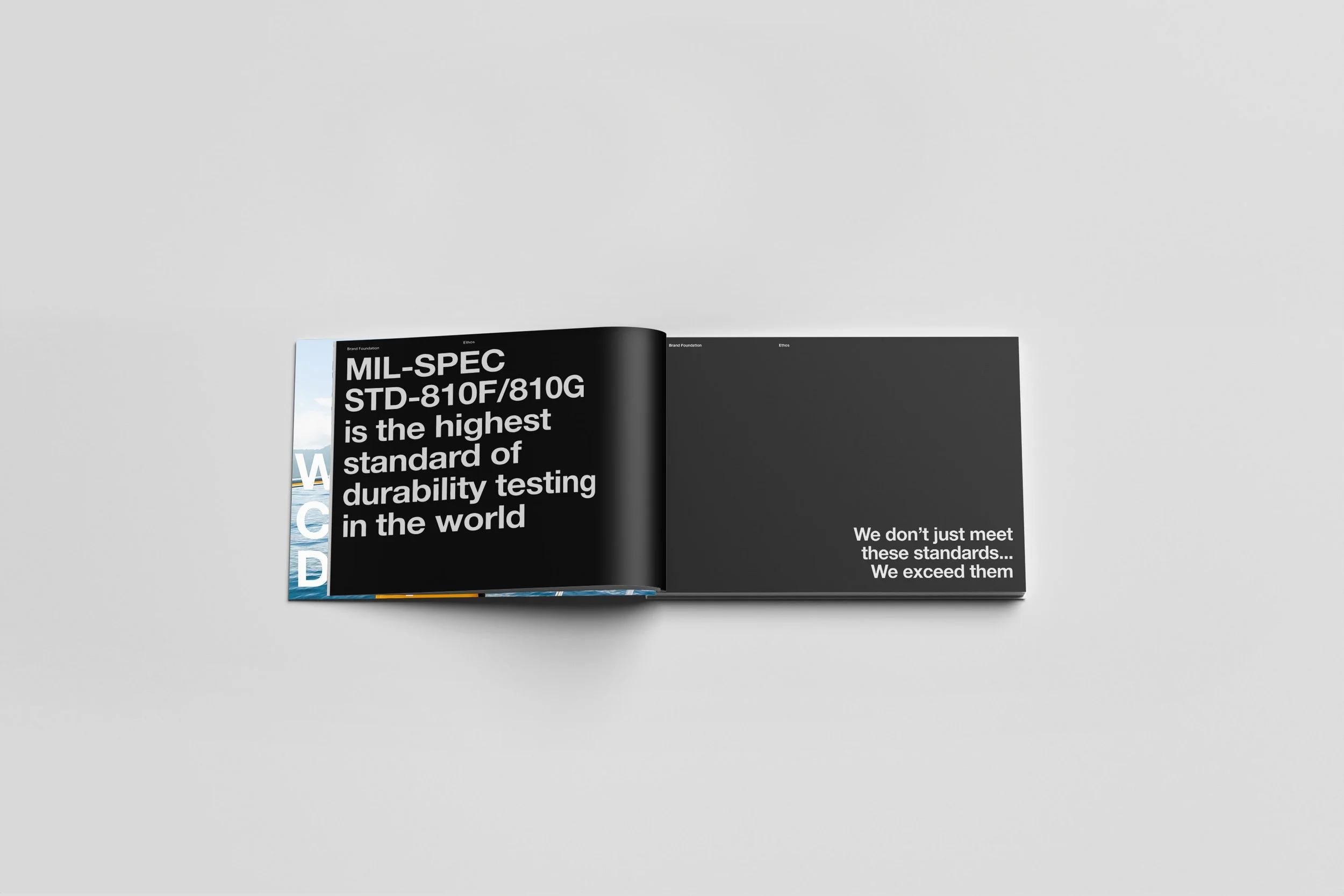
The first step was going back to the source. I dove into five decades of Pelican history. Products, campaigns, internal docs, old logos, and everything in between. From that audit, themes started to emerge: boldness, purpose, grit, and an uncompromising attention to detail. These became the red thread of the brand foundations book. Pure utilitarian. No frills. I built a flexible guide that balances clarity with inspiration. It outlines who we are, what we stand for, how we speak, and how we show up visually, all in a tone that stays true to the Pelican brand. This book was not just about guidelines; it was about a shared understanding.
My Role
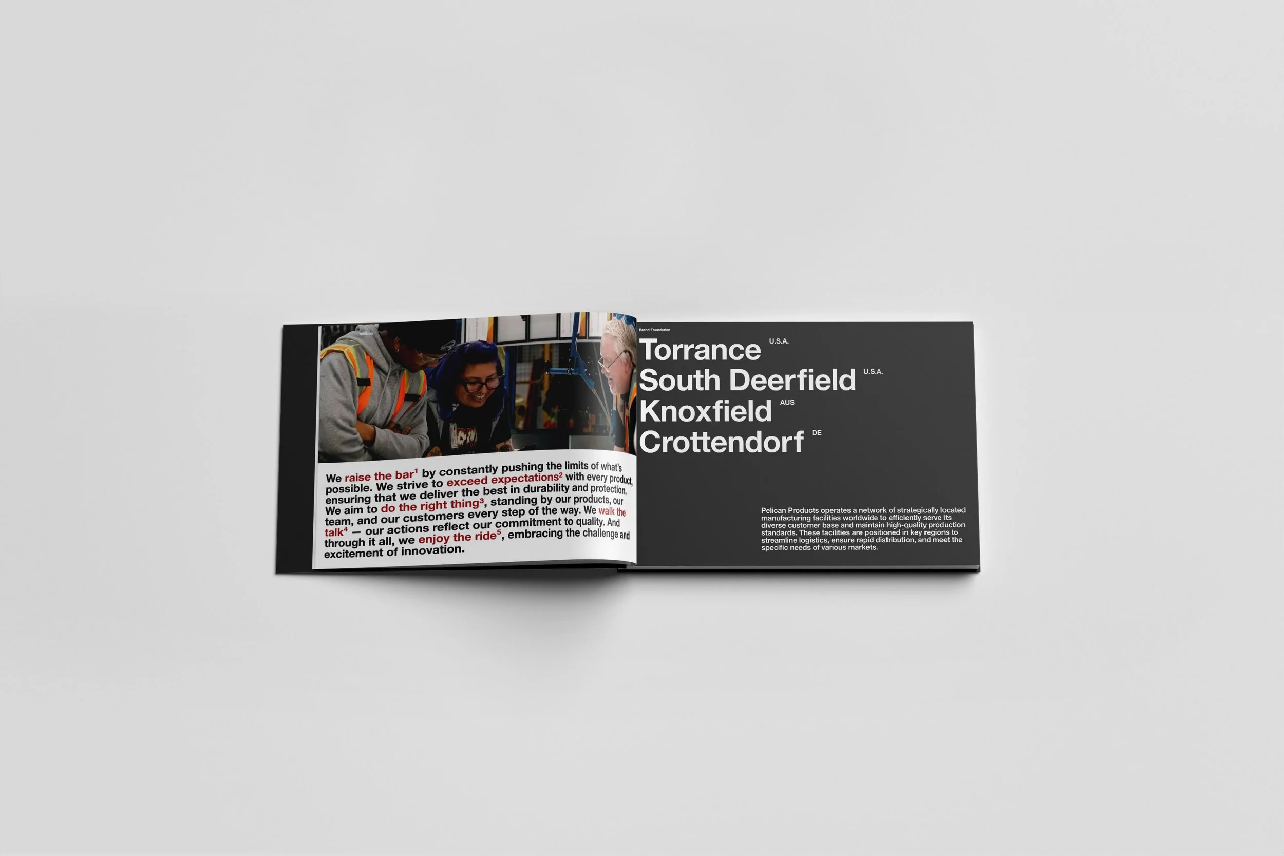
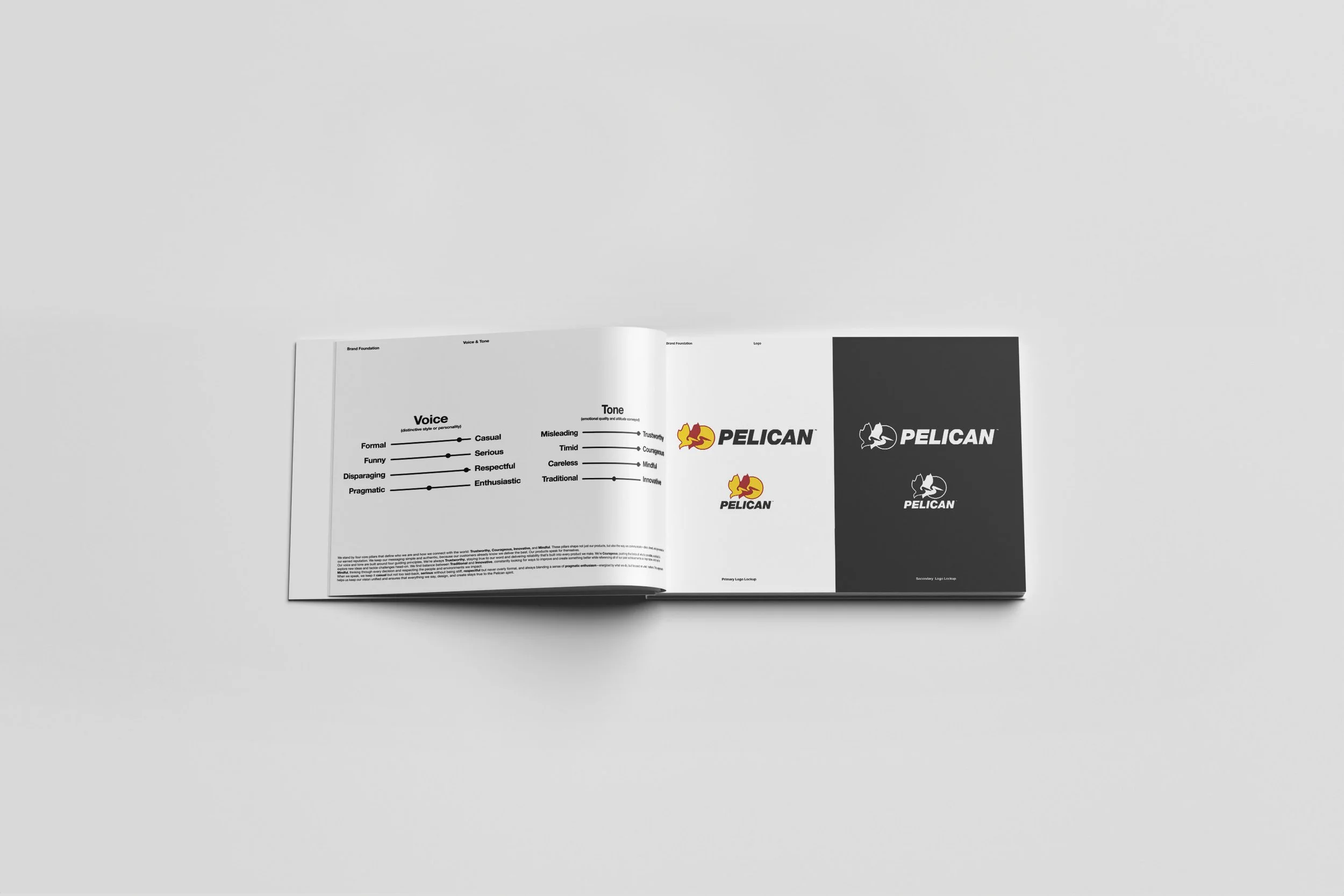
I spearheaded the creation of this brand foundations book from start to finish, working closely with the art director, design team, and cross-functional partners. Together, we ensured the voice resonated both internally and externally, and that the visuals aligned with our mission. This book serves not only as a reference but as a rallying point for everyone who engages with the brand, helping us speak with one voice and move with a unified purpose. Below, you'll find some sample spreads along with a link to the full book.


Book 2: Graphics Standards Manual
Problem to be solved:
With a similar problem to be solved as what was mentioned in the Brand Foundations Book, Pelican’s visual identity had become fragmented over time. With decades of creative assets developed by different teams, agencies, and individuals, many without a clear brand system in place. The result was a patchwork of inconsistent logos, colors, typography, and design approaches. This lack of cohesion diluted the brand’s impact and made it harder to establish a strong, recognizable presence across channels. From packaging and print ads to digital content and trade show materials, no two assets felt like they came from the same brand.
My Approach:
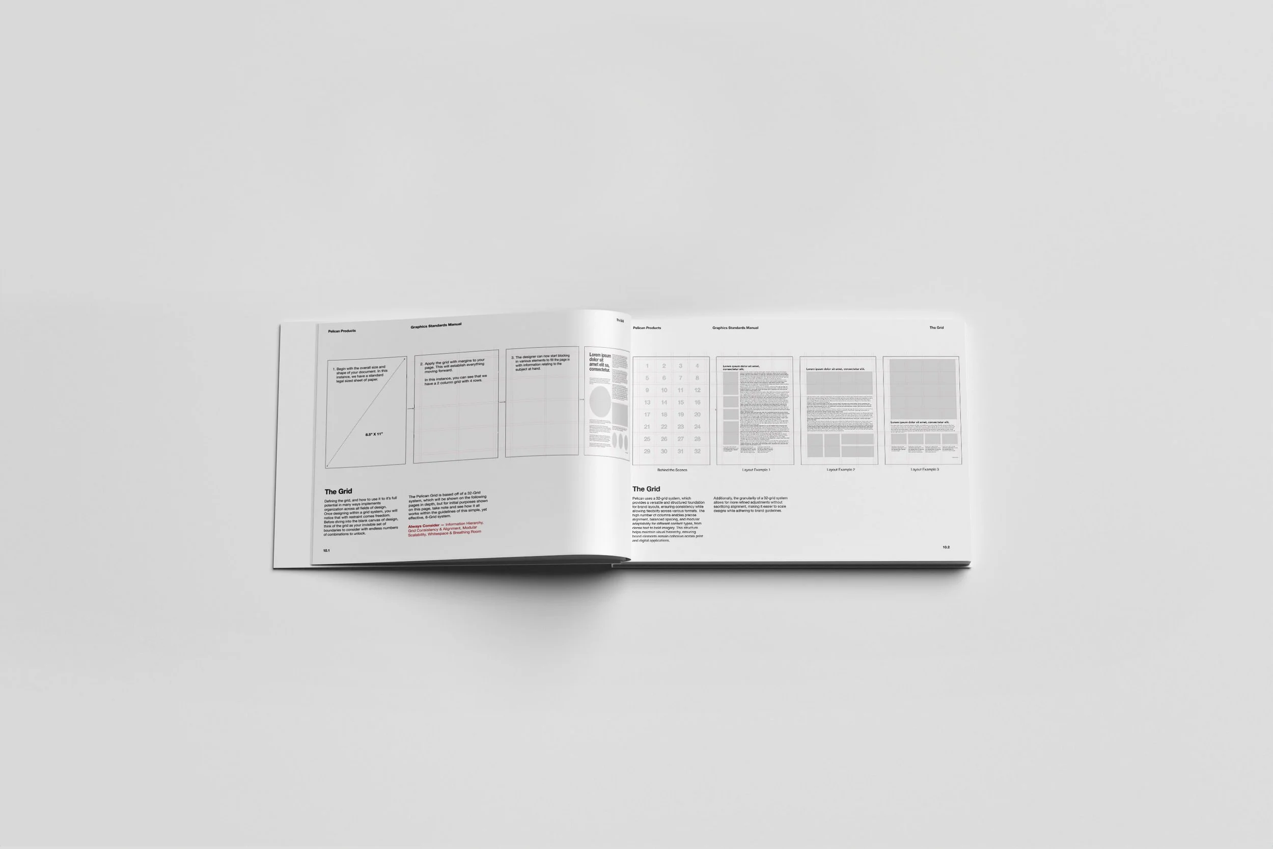
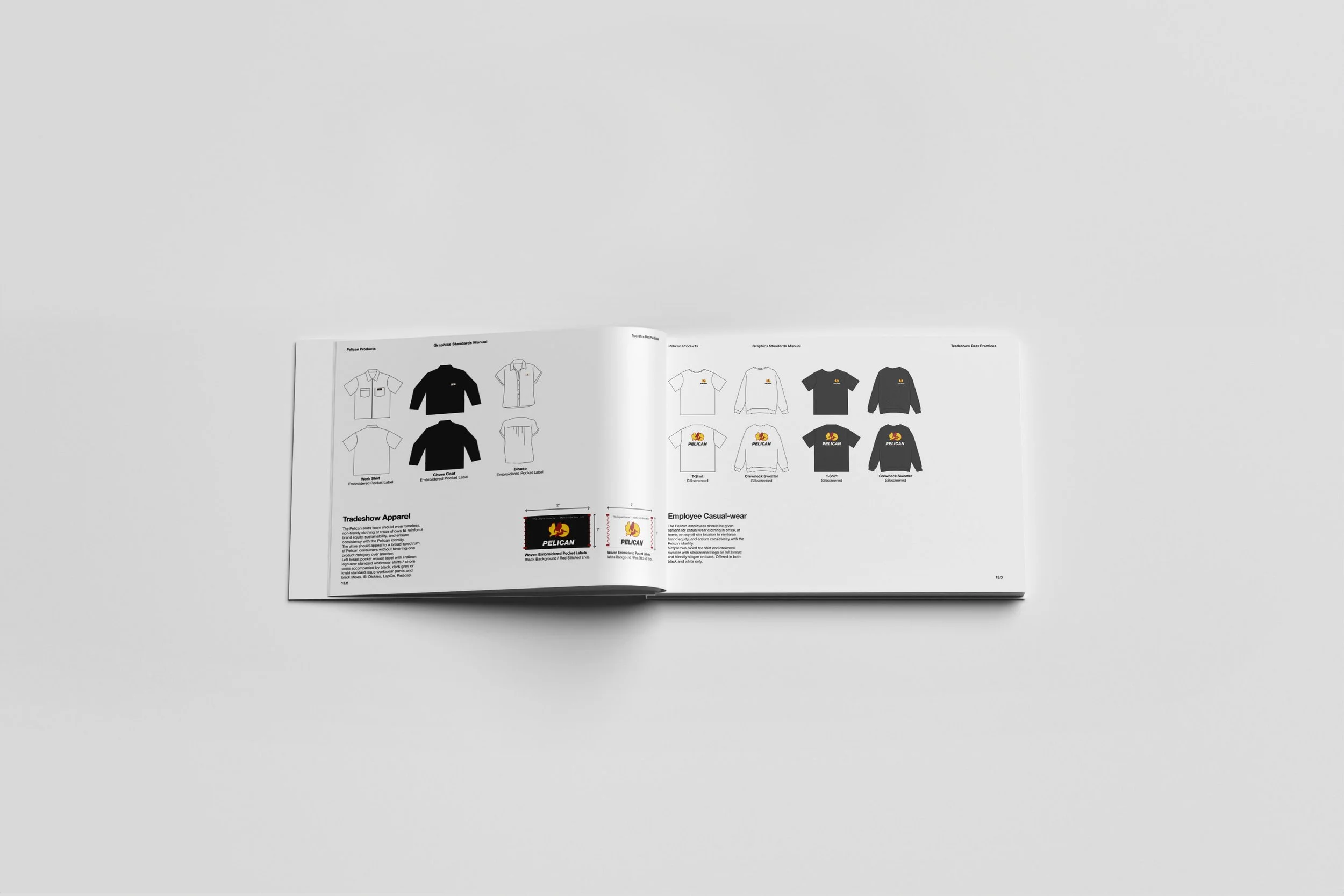
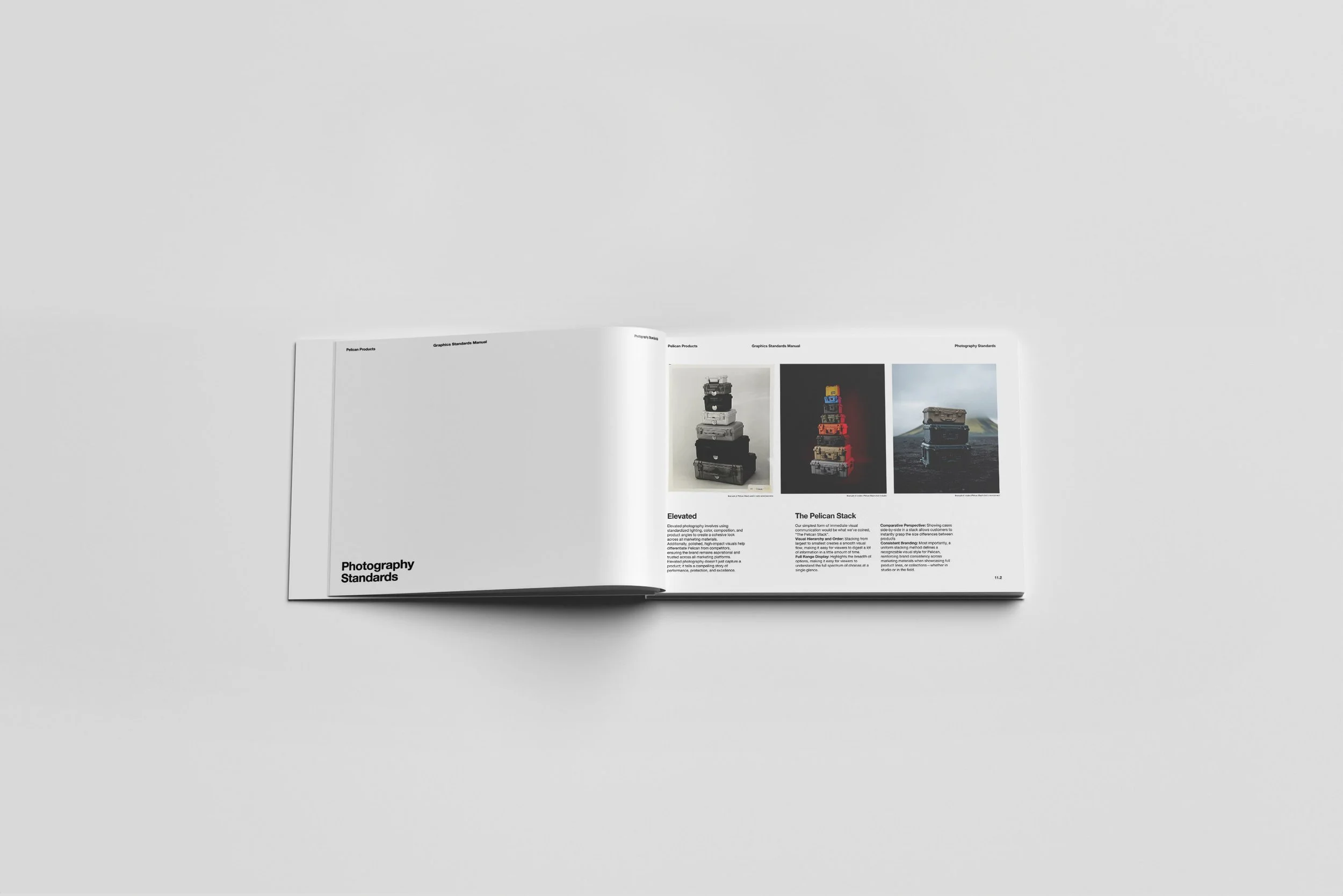
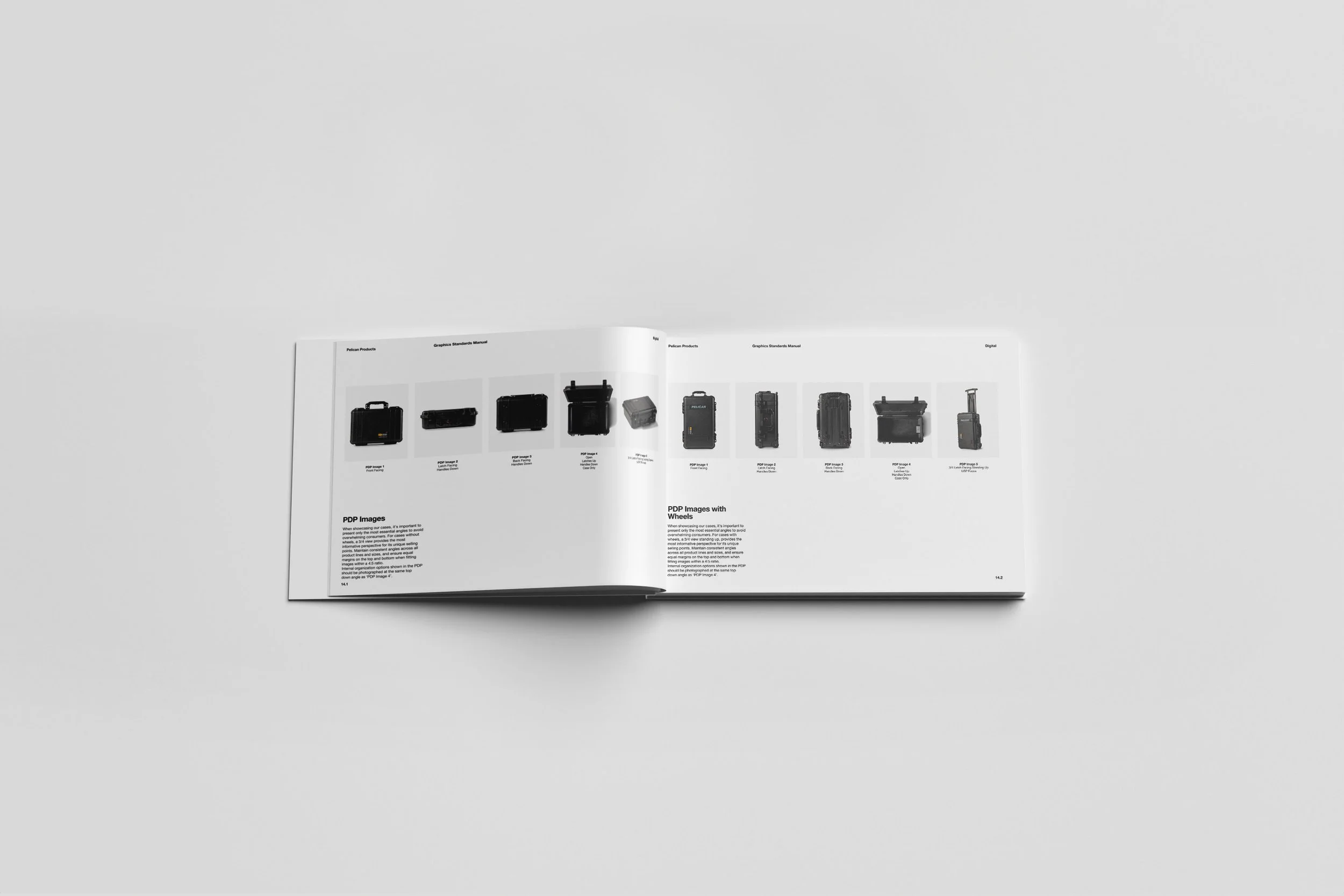
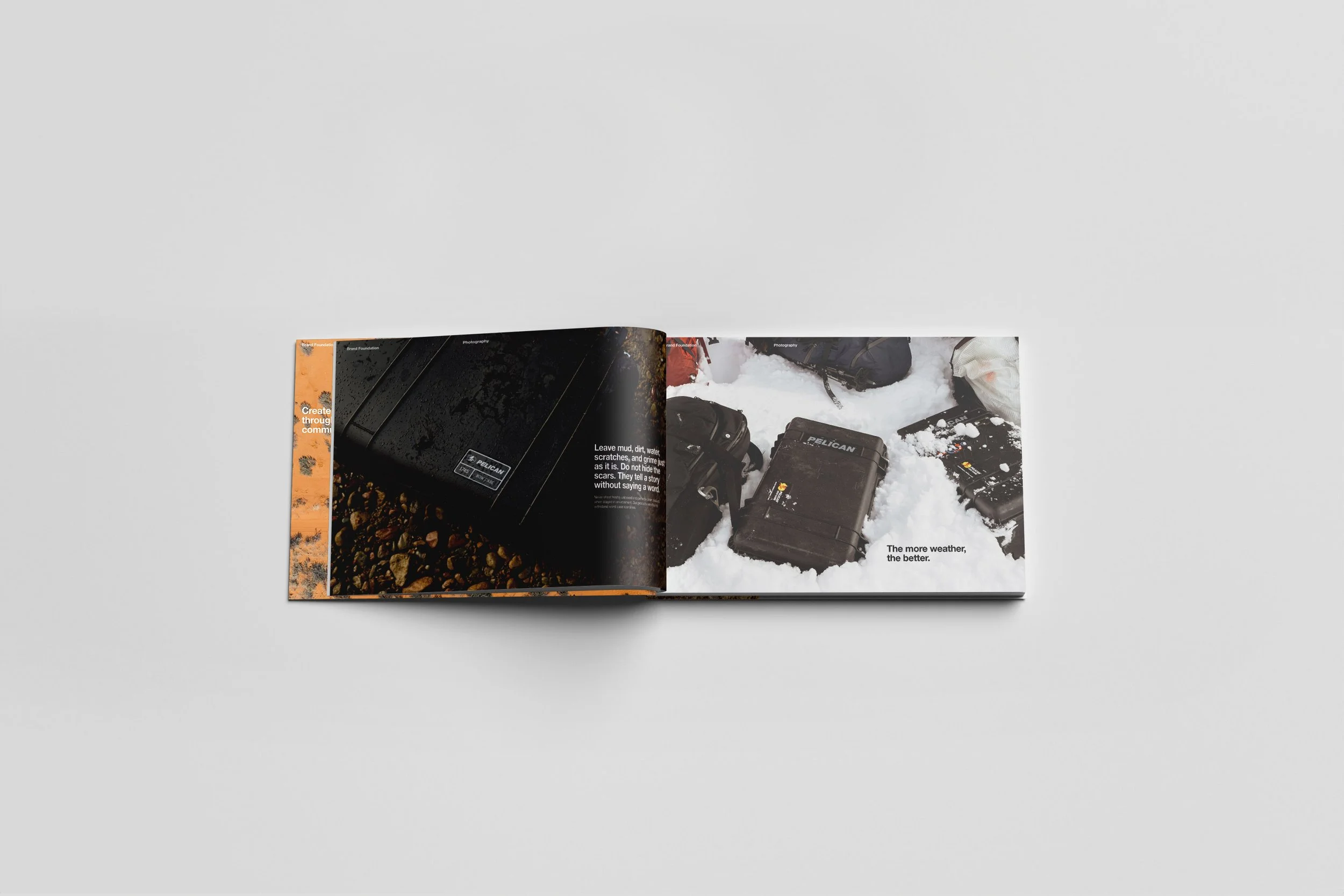
To address this, I started by conducting a comprehensive brand audit. Digging through archives, analyzing current and past creative, and identifying patterns of inconsistency across all mediums. Once I had a clear picture of the problems, I reverse-engineered a unified system that honored the legacy of Pelican while modernizing its presentation. I built a graphic standards manual that established clear rules and rationale for logo usage, color palettes, type choices and hierarchies, layout grid systems, iconography, photography guidelines for both in studio and on white along with in situation and environmental, and more. This book was built to offer designers flexibility within a framework to keep the brand dynamic without compromising consistency.
My Role
I led every step of this initiative, from research and strategy to design systems and documentation, working closely with the Art Director throughout the entire process. I collaborated with stakeholders across marketing, sales, product, and executive leadership to ensure alignment and adoption. Together with my Art Director, we designed and executed the standards, developing materials that were both aspirational and practical for internal teams and external partners. The result is a 100+ page living document that not only addresses decades of inconsistency but also sets Pelican up for a future of clear, cohesive, and confident creative expression. Below, you'll find some sample spreads along with a link to the full book.